I want to talk a bit about the techniques and philosophy behind C3’s art style and presentation. It’s a broad subject and it covers more disciplines that just my own, but I wanted to give my view on why the game looks the way it does, why we made the decisions we did to push us in that direction, and what our end goal is in regards to its visuals.
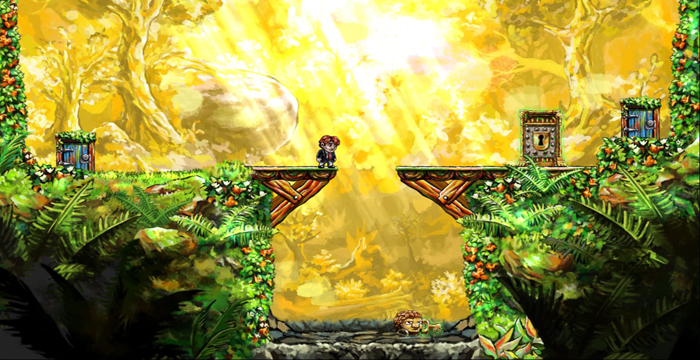
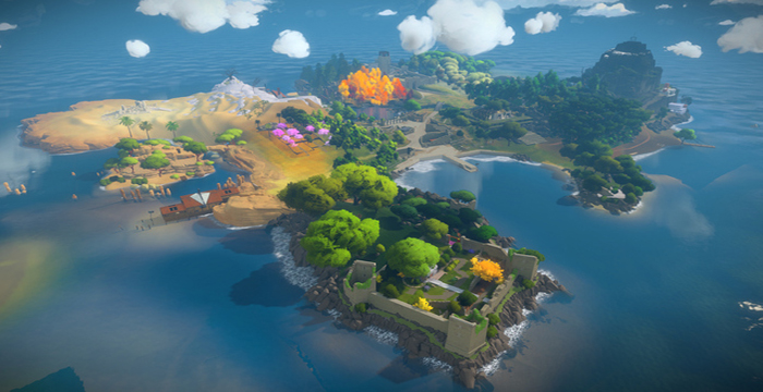
To start, I wanted to comment on the indie space in general. We’ve seen massive jumps in visual quality since the boom of the indie game back in ‘08 or so, moving from a game like Aquaria, that looked very nice but was still flat 2D assets with few environmental effects and animations, to a game like Gone Home, which is 3D and full of high detail art assets. Another good example is the jump from Braid to The Witness. Both are beautiful, but The Witness is much more detailed and complex simply because it’s 3D and has a much larger playspace. Indie projects are getting more ambitious and are quickly approaching AAA quality (depending on how you define AAA). It’s a great thing but it’s also pretty daunting, because I feel a large of part of being competitive is the visual quality of your game.
One of these is more difficult to pull off than the other
By visual quality I don’t mean how high resolution your textures are, or how many polys you’re pushing and still maintaining high framerate…necessarily. While those things are important, I really mean how all of the visual elements create a unique and appropriate vision for the game. And as these games become more ambitious keeping that level of quality becomes more of a challenge.
So back to C3. We knew the game had to be 3D. Above just wanting a game about world rotation, we envisioned the freedom of movement that would come from 3-axis rotation. That’s what we wanted, that’s what’s core to the experience. And we built the game for a long time without even thinking about the art style. We are a team of designers, with degrees in design, so figuring out the gameplay experience was first and foremost. And when we did start talking about art, we went way too large with it. We originally thought the game’s world should be very mechanical, that there were large pistons and sprockets and levers that powered the world rotation. Apart from not having the capabilities to create all the assets needed for this look, it also just didn’t fit. We threw in a bunch of industrial assets we got our hands on, and it was just a mess. The game was ugly…damn ugly. I thought about including a screenshot here, but I’ll save you the torment, and us the embarrassment.
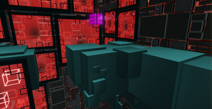
So after Cass came on the team, he and I sat down and came up with a new vision for the art style. We went abstract and alien. That’s where the cubed geometry really came through. It made sense for the rotation, because a random cubic structure looked fine in any position or rotation, which was the biggest issue with our mechanical layout. A lot of the assets only looked correct right side up, never upside down.
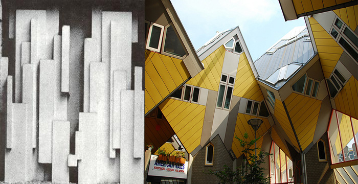
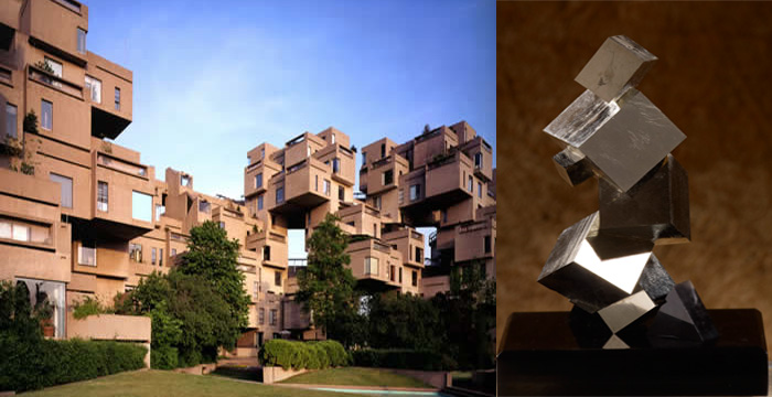
Here are a few of the references we gathered
The synthetic materials were soon to follow, as we wanted environments that had a manufactured yet unnatural feel to them. We wanted it to look like the Cube was alive and building upon itself. From there, we went down the particle effects and lighting road, knowing that we wanted a lot of motion and strong moments of color. The look of the game is still something that’s ongoing but we’re pushing to create something that really stands out visually, something that’s sharp, sophisticated, and memorable. And it feels like we’re chasing AAA quality.
Of course we know this will never look like a multimillion-dollar game. We don’t have an asset list a mile long. We don’t have contracted effects or material artists. We’re trying to create the look from basic techniques used in creative and clever ways. If you look at any of the individual particles, textures, or materials they’re quite simple, with only a few moving parts. That’s another benefit of the cubist look. It allows us create elaborate and complex structures and effects through simple shapes, which saves time and allows us to focus more on the gameplay.
Nothing but squares
There are some concerns with this route, however. We don’t want things to become stale because you’re seeing similar structures over and over. If the cube structures are too random they all blend together, and nothing feels memorable. Similarly for the particle effects, if they all pull from the same idea, none will stand out on their own. That’s actually one of the bigger problems we’re dealing with at the moment. We need set piece moments throughout the game that support the story and the world, and we’re trying to figure out just how many we can create with the limited resources that we have.
It’s a challenge, but the game is looking great and will only continue to improve. I don’t think we’ll ever be compared to AAA titles, but I think we will end up with a visual style that’s both striking and memorable.
Thanks for reading.
Donald

Leave a comment